Muscheltaucher.com
2025
WordPress
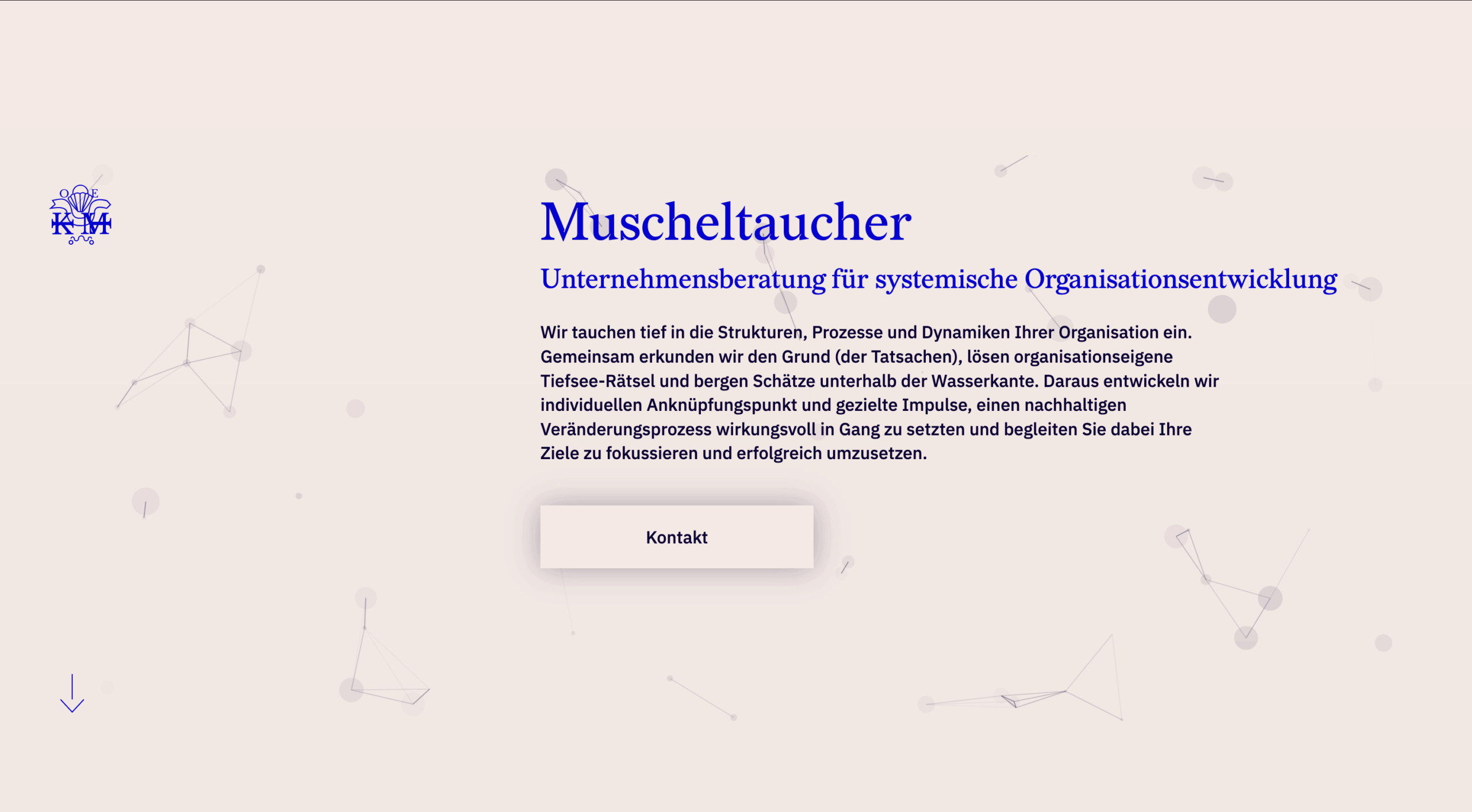
Muscheltaucher
Muscheltaucher is a Düsseldorf based business consultancy. Humans in focus with a systemic approach we developped an elegant and classy yet reduced and modern appearance. Soft tones mix with a bold blue and modern typefaces.
Details
Modern and classy
Finding the sweet spot for a modern person in a classy industry. The headline font “Redaction” looks like a calm and classy at first. The details are modern and playful. The logo seems to be an old signet. In fact it features the letters of “Organisations Entwicklung”, “Isabelle Karp” and “Muschel Taucher” with an arrow moving forward while diving and resurfacing.
Animation
Animation with purpose
The animation in the background brings users into interaction. Just as systemic organisational development does. The patterns resemble the systems that everything including organisations are made of.
Content and space
Breathing
Organisational development is a guideline for development. Yet it has to be done by the organisations themselves. For that it needs space to listen and to change.